Ecommerce website design in Japan – see your store before you decide
Good ecommerce design is about more than a stylish look. It helps shoppers find the right product quickly and check out with confidence. When a store looks fine yet sales stay flat, the cause is usually in the UI, the mobile experience, the photos or the way trust is shown. This page covers the design principles that make online stores sell and how UNANOBO starts with a free demo built from your own products.
- Free demo – decide after you see it
- By message, in Japanese or English
- One person from demo to launch
FREE DEMO
See your store redesigned – free
Send your current store URL, or your logo and photos of key products. We build a free demo of an ecommerce design focused on an easy path to purchase.
- A store design built with your own products
- Check the path to the cart on your phone
- Practical notes on UI and product photos
Four principles behind ecommerce design that sells
In ecommerce website design, colors and fonts matter less than how short and clear the path to purchase is. Stores that sell well in Japan tend to share four traits.
- Clear UI: categories, search and filters make any product reachable in two or three taps
- Mobile first: one-hand use, with price and the add-to-cart button always easy to spot
- Photos that explain: shape, texture, size and use are clear from the images alone
- Visible trust: shipping fees, delivery times, returns and the seller's details are easy to find
When you look at stylish stores for inspiration, compare them on these four points. It quickly shows what is worth borrowing for your own shop. Start by reviewing your current site for ease of buying, before taste.
Where online store designs lose sales
If design work has not lifted sales, shoppers are probably dropping off somewhere on the way. Common patterns include:
- The home page is a long slideshow, and products sit far below it
- Product photos use different backgrounds and lighting, so listings look messy
- Shipping costs and delivery times only appear at the last checkout step
- Buttons and size or color selectors are too small on a phone
- Thin, pale type chosen for mood makes prices hard to read
- Company details and the legally required seller information (Tokushoho) are hard to find, which worries first-time buyers
A quick test: on your own phone, pick a product from the home page, add it to the cart and go as far as the checkout screen. Any spot where you hesitate or cannot find what you need is the first thing to fix. Ask a friend to try it too – they will notice things you no longer see.
If several of these apply,tidying the paths from the home page to product pages often helps more than a full rebuild. Our guide to product page improvement goes into the details.
Send us your store URL and we will show you a free demo with a clearer path to purchase.
Ecommerce UI basics: from home page to checkout
Give each page one clear job and the whole store stays consistent. The essentials:
- Home page: one line that says what the store is, plus quick entry points to best sellers, new items and categories near the top
- Category pages: consistent photo ratios, readable names and prices, sorting and filters for larger catalogs
- Product page: photos, price and the cart button on the first screen, followed by description, size chart, reviews and related items
- Cart and checkout: fewer fields, shipping and total shown early, accepted payment methods shown as icons
- Header and footer: cart and search on top; shipping, returns, contact and seller information at the bottom
Shopify and BASE themes already follow these basics, so building on a theme and adding your brand's character is usually faster and more stable than starting from scratch. For changes a theme cannot handle, see Shopify customization.
What the free demo gives you
- 01A working demoA demo site you can open and click through on a computer and a phone.
- 02A structure proposalWhich pages you need, what goes on each and where visitors get in touch.
- 03Plan and estimateAfter you have seen the demo you get the plan to launch and an estimate.
Why it is safe to ask
- The demo is free. If you decide not to go ahead, it costs you nothing.
- Everything happens by message, in Japanese or English.
- Your domain, hosting, ad and analytics accounts stay in your name.
- The founder handles your project from the first demo to growth after launch – one contact all the way.
Demo sites we built
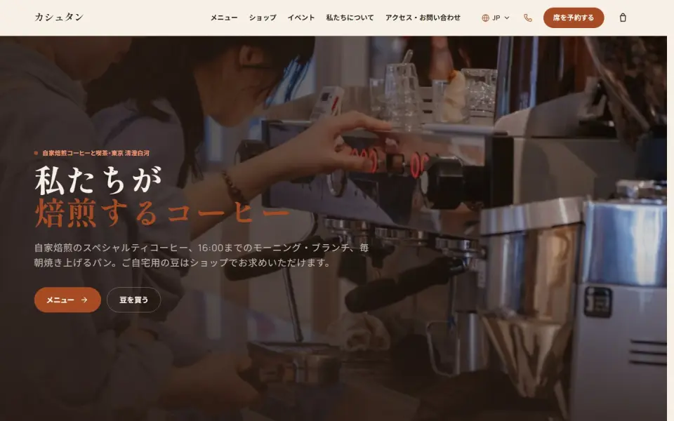 Café & roastery – KashtanMenu, events and an online bean shop
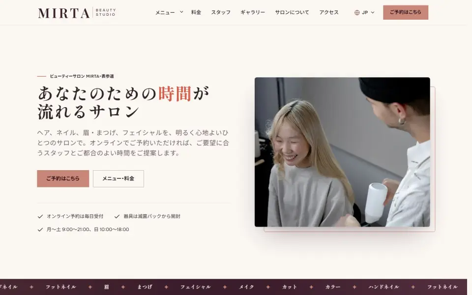 Beauty salon – MIRTABooking form, price list and team
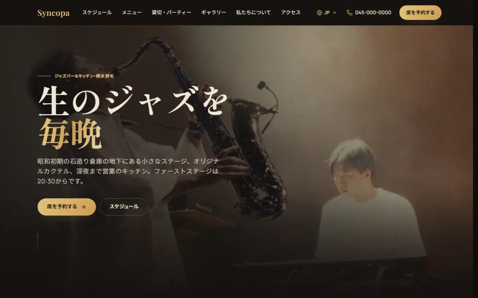 Jazz bar – SyncopaLive schedule, menu and table booking
Template demos with fictional brands. Yours is built with your own brand and content.
Product photography and brand presentation
Online, shoppers cannot touch your products, so photos and brand presentation carry most of the design. Settle these points before shooting and designing:
- Photo rules: same background, light direction, placement and aspect ratio
- Shot list: front, angles, material close-ups, a size reference and the product in use
- Colors and type: two or three colors from your logo; prices and buttons tuned for readability
- Voice: product names and descriptions written in one consistent tone
If you want to tell your brand story in depth, a separate brand site next to the store can work well – see brand website design. If photos are not ready yet, settling the layout with placeholders first means you only shoot the images you actually need.
We use the photos you already have to build a free demo of your store design.
What to prepare before you brief a designer
The more you have ready, the more specific the proposal can be. Gather these:
- Logo files and the colors your brand uses
- Photos of key products and a list of products and categories
- Shipping fees, delivery times and return or exchange terms
- Your preferred platform (Shopify, BASE, WordPress/WooCommerce) or the one you use now
- Two or three stores you like, with what you like about each
Specific reasons help most: "this filter is handy" or "I like how the photos are laid out" says more than "nice design". Keep the domain, payment, ad and GA4 accounts in your business's name so you stay in control of your store.
How UNANOBO designs your store: a free demo first
Before you commit, UNANOBO builds a free demo of your online store using your products and brand. The home page and product pages work like the real thing, so you can click through on a computer and a phone and judge how easy it is to buy.
The process is simple: free demo, feedback, launch, growth. The founder handles every project personally – from the first demo to improvements after launch, plus SEO, Google Shopping and Meta Ads if you need them. Everything runs by message, in Japanese or English.
How it works
- 01
Free demo
We start with a free demo built around your brand.
- 02
Feedback
Structure, tone and details are refined with you, on the demo itself.
- 03
Launch
The site goes live on a solid SEO foundation.
- 04
Growth
SEO and ads take it further, guided by the numbers.
FAQ
What does the free demo include?
A working design built with your logo, colors and product photos, centered on the home page and a product page. You can check the mobile view and the path to the cart. You decide whether to continue after seeing it.
Do I pay anything if I decide not to go ahead?
No. The demo is free, and there is no cost if you stop after seeing it. If you continue, you receive a structure proposal, a plan and an estimate based on the demo.
Can you redesign my existing Shopify or BASE store?
Yes. In most cases we can keep your current store and improve the design through theme changes and adjustments, so product data and order history stay in place. Whether switching platforms makes sense is something we look at together during the demo stage.
Can we start without finished product photos?
Yes. We settle the layout with the photos you have or placeholders, then give you a clear shot list. Knowing the layout before the shoot means fewer reshoots.
How long does it take to launch?
It depends on the catalog and number of pages. Typically a small store built on a theme takes one to two months; larger catalogs or custom features take longer. You get a concrete timeline in the plan after the demo.
Can we work entirely by message from outside Japan?
Yes. Briefing, demo review and change requests all run by message, in Japanese or English. We reply to inquiries within two business days.
Related pages
FREE DEMO
See your store's new design first
Send us your store URL, or your logo and a few product photos, and we will build a free demo of your ecommerce design. Decide after you have seen it.